Bubble is the world’s only full-stack, no-code platform.
Bubble enables anyone to design, develop, and deploy fully-featured web applications without any coding expertise, making it an accessible yet powerful tool for creators. In the rapidly growing no-code space, Bubble stands out by providing a level of complexity and customization unmatched by other platforms. This versatility enables users to create intricate, multi-featured apps, like custom marketplaces, social networks, or food delivery services, all without touching a line of code. As a result, it has attracted a wide array of users, from solo entrepreneurs to larger businesses looking to streamline their development processes.
Bubble’s unique full-stack capabilities empower users to take control of the entire app-building process, from user interface design to backend workflows. This all-in-one platform democratizes software development, offering a viable alternative to conventional, code-intensive methods. Bubble’s robust editor lets users create dynamic content, integrate third-party services, and set up complex logic flows, giving non-developers the freedom to launch sophisticated applications. While other no-code tools excel in specific areas, Bubble’s unmatched flexibility and depth have positioned it as the go-to choice for those who want to bring complex, custom ideas to life.
The Maison design system let Bubble achieve rapid customer growth.
Recognizing the need to overhaul the editor’s user experience, I led a cross-functional team to reshape the Bubble interface. We integrated customer feedback, worked in parallel on various features, and carefully coordinated product releases, transforming the platform’s usability. Maison, the design system we developed, provided a cohesive framework that unified the editor's interfaces under a forward-thinking component structure. This adaptive design allowed Bubble to scale efficiently while offering users a more intuitive, visually consistent experience.
The Maison system ensured that Bubble’s design was not only visually appealing but also optimized for functionality and future expansion. Maison brought modern standards to Bubble, introducing best practices from leading design tools to create an editor that could cater to a diverse user base. This system allowed for better organization, making it easier to implement new features and ensuring the platform remained accessible as it grew. Maison’s structured yet flexible framework facilitated a smooth, logical interface that significantly reduced the learning curve, enhancing both new and existing users’ experiences.
Maison marked Bubble’s entry into the ranks of modern design tools, reshaping the editor’s functionality and accessibility. By implementing a cohesive design language, Maison made Bubble’s editor more approachable and intuitive, thereby attracting a broader, more diverse user base. With the addition of Maison, Bubble users could rely on consistent, predictable behaviors across the platform, making it easier to build and iterate on their apps. For both new users and experienced builders, this consistency translated into an experience that felt far more professional and polished, and considerably less frustrating.
The new design language also meant that Bubble could better compete with other leading browser-based design and development tools. Maison’s structure helped align Bubble’s interface with industry standards, incorporating design patterns familiar to users of other web-based tools. Additionally, Maison introduced enhanced support for responsive design, addressing a long-standing gap in the platform’s capabilities. These improvements enabled users to build more complex, adaptive applications, making Bubble an attractive choice for creators with a high standard for both aesthetics and usability.
🕰️ It’s early 2019. Using Bubble is a daunting task.
Bubble’s UI in 2019 was the result of years of bootstrapped development, leading to an interface burdened with design inconsistencies and heavy technical debt. This patchwork approach created a steep learning curve for new users, as the editor lacked a cohesive visual language and predictable behaviors. Essential features were often “hidden” within menus or workflows, and the platform's unpredictability made it challenging for users to intuitively navigate and utilize its capabilities. These issues contributed to a fragmented user experience, as users encountered barriers that prevented a smooth, efficient building process.
The Bubble interface prior to design efforts, while capable of building complex products itself, didn't possess the ease of use or reliability needed can sustain adoption.
For most, using Bubble was akin to navigating a complex, “working wireframe.” While the platform offered powerful functionalities, they were scattered and difficult to locate, forcing users to spend considerable time searching for solutions. Many users relied on Google searches and the Bubble community forums to resolve issues, piecing together information from various sources to overcome platform limitations. Despite its strengths, Bubble’s usability challenges made it a daunting tool, accessible primarily to users willing to navigate this maze to unlock its potential.
“Yeah, it’s a pain, but it’s still way faster than learning to code”.
Despite these usability hurdles, Bubble had succeeded in attracting a passionate user base of over 500,000 registered users. For entrepreneurs and builders, Bubble represented a unique opportunity to develop and launch web applications without the need for a full-stack engineer or extensive coding knowledge. These users valued the platform’s ability to empower them to bring their tech ideas to life independently, an alternative to conventional development paths that often required substantial capital and technical expertise.
Bubble’s users were highly engaged and vocal about their experiences, frequently providing feedback on both their frustrations and their needs. This feedback highlighted that while Bubble’s UX posed significant challenges, users were willing to endure the pain points because of the platform’s unparalleled ability to let them create complex applications on their own. The dedication of these early adopters underscored the platform’s potential—and the pressing need for improvements that could make Bubble accessible to an even wider audience.
Bubble needed an overhaul to grow an audience beyond its early adopters.
To expand beyond its initial user base, Bubble needed to address its usability issues and create a more polished, intuitive experience. This transformation was essential to ensure that marketing and growth efforts could effectively drive new user adoption and that new users could build applications without getting stuck. By engaging with the entrepreneurs who relied on Bubble for their businesses and by actively using the platform ourselves, we identified a set of core priorities to guide the overhaul process:
-
Create consistent UI appearance and behaviors
Consistency was critical for removing friction and improving usability. We needed to establish a cohesive design language and predictable behaviors across the platform, resolving the workflow headaches that plagued users. This would not only enhance the current experience but also provide a solid foundation for future feature development.
-
Adopt common precedents established by best-in-class design software
To make Bubble competitive with other browser-based design tools, we aimed to incorporate familiar design patterns and interactions from leading tools like Figma and Webflow. This alignment would make the platform more approachable to users transitioning from other design environments, easing their learning curve and making Bubble more appealing to a broader audience.
-
Deliver proper support for responsive design
Responsive design was a major pain point for Bubble users, as the platform’s outdated JavaScript layout engine made it difficult to create apps that adapted seamlessly across different screen sizes. Modernizing the platform to support responsive design was essential for user satisfaction and for aligning with current web design standards, enabling users to build applications that met the demands of a multi-device world.
The new Bubble editor
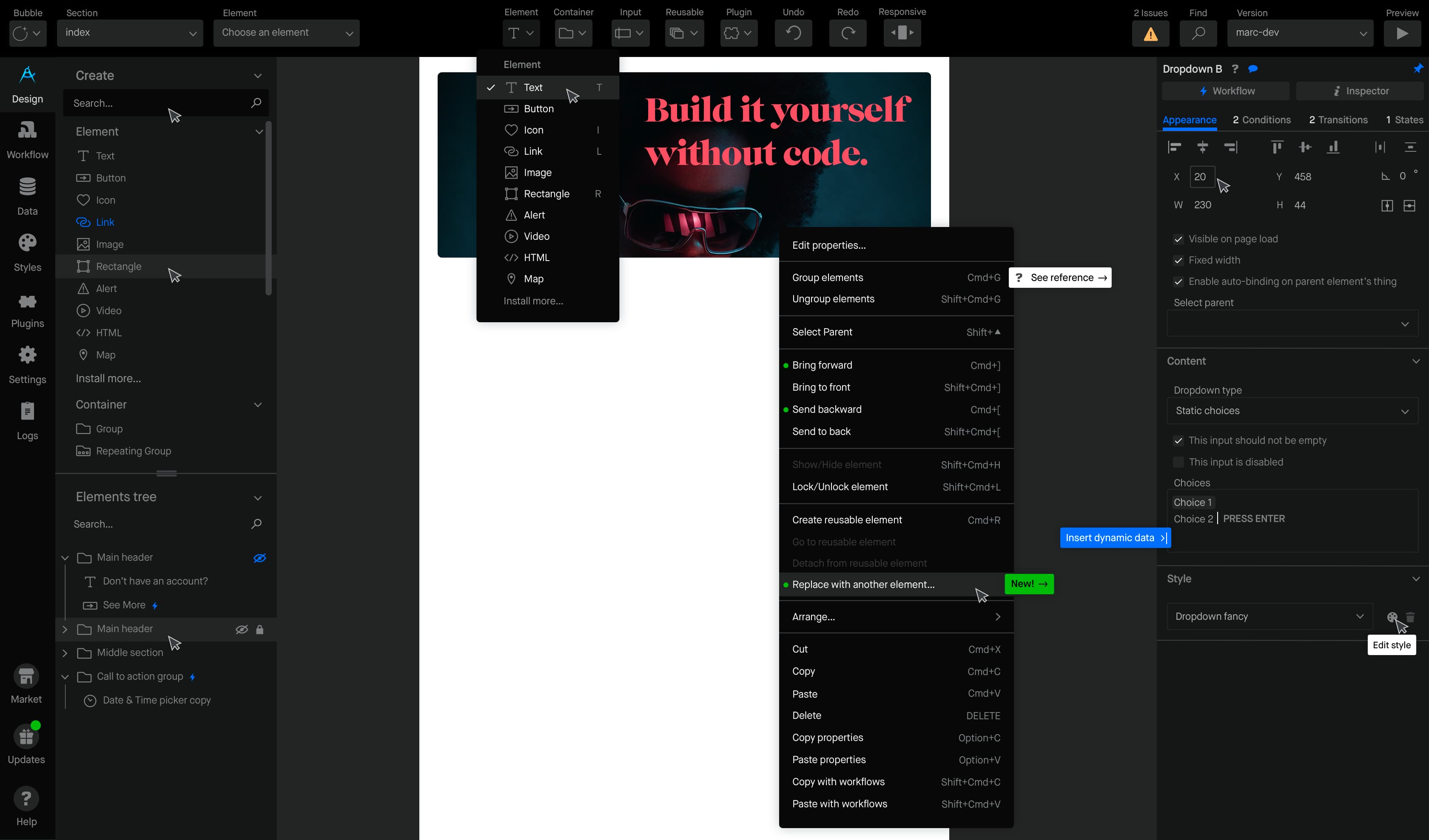
The Design tab is where users define and customize the visual layout and style of their application. It provides a canvas where elements like text, images, buttons, icons, and input fields can be added and arranged using a drag-and-drop interface. The tab includes tools for configuring each element's properties, such as size, color, font, borders, and alignment. There are also options for responsive design, allowing elements to adjust to different screen sizes. With layering and grouping capabilities, users can create organized, complex layouts.
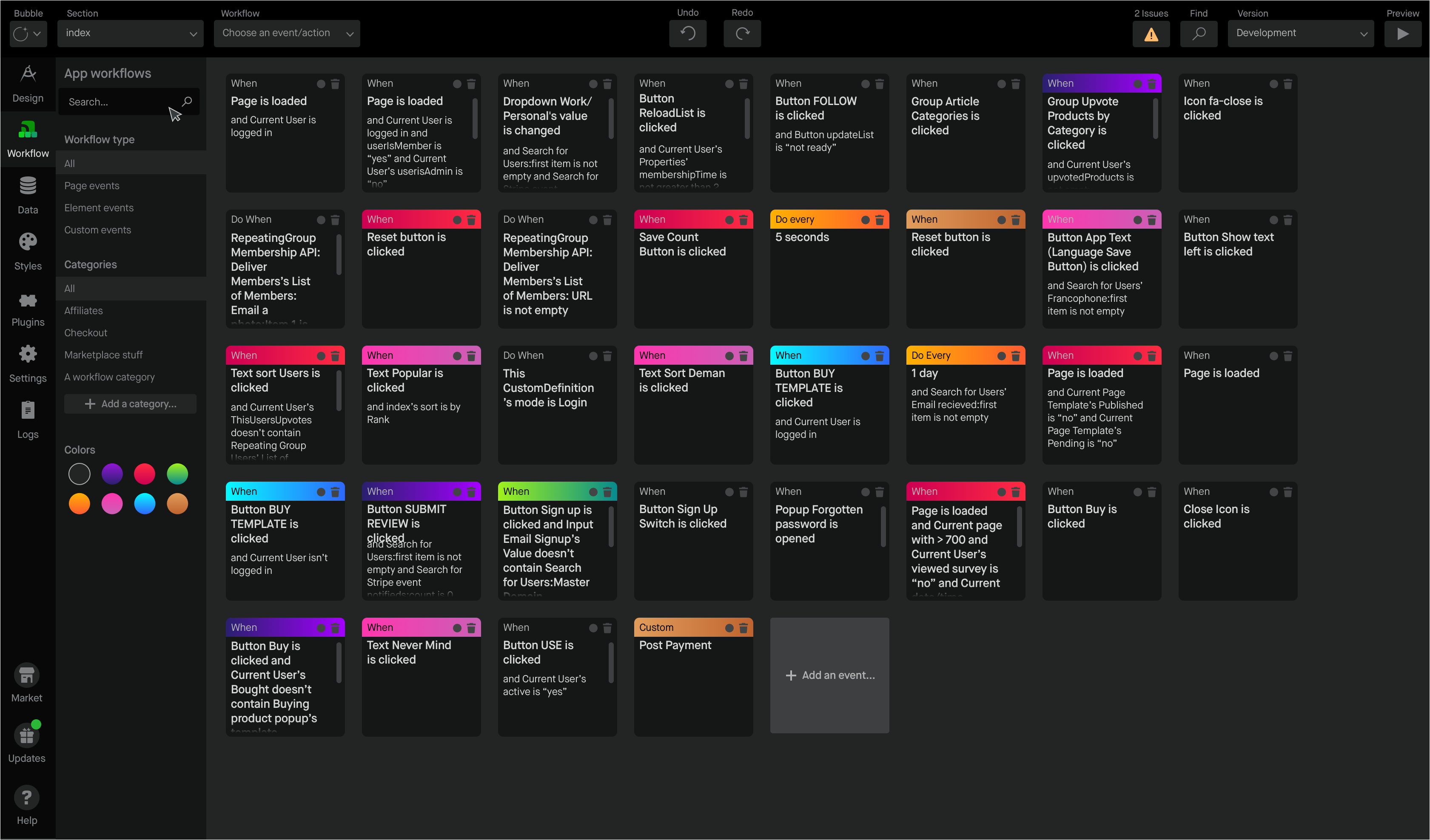
The Workflows tab in the Bubble editor is where users define the actions and logic that drive their app's functionality. This tab allows users to set up workflows triggered by specific events, such as a button click, page load, or form submission. Each workflow consists of a series of actions that can manipulate data, navigate between pages, send emails, or update elements on the page. Users can set conditions on workflows, making them execute only if certain criteria are met, enabling complex, dynamic behaviors. This no-code approach to defining workflows empowers users to create sophisticated application logic by sequencing actions without writing code.
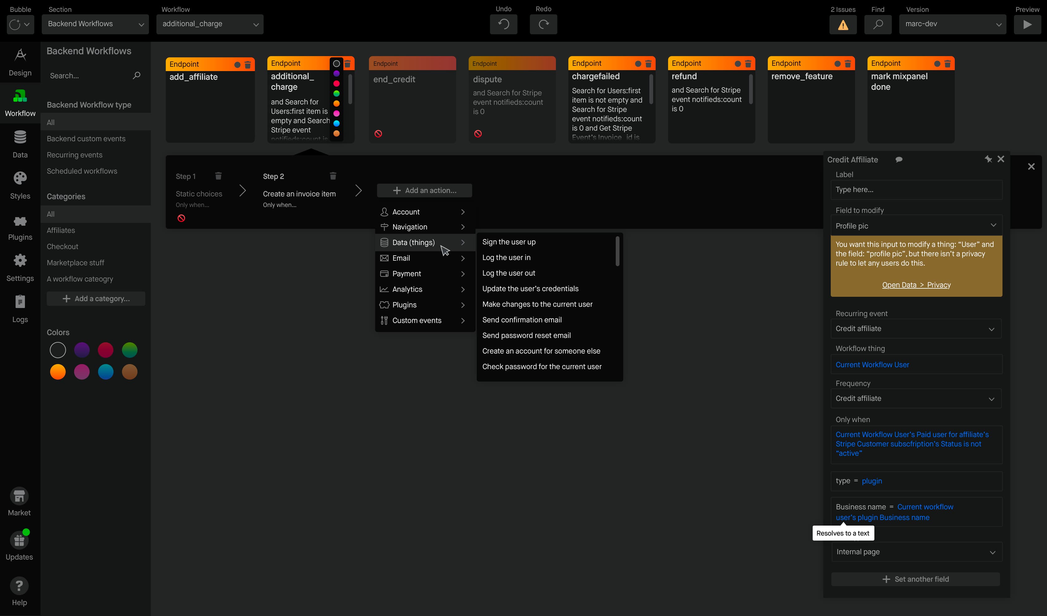
Backend Workflows are workflows that run on the server rather than the client side and can be triggered from external sources or scheduled to run at specific times. They are particularly useful for tasks that need to happen independently of user interaction, like processing large batches of data, sending periodic notifications, or handling complex calculations.
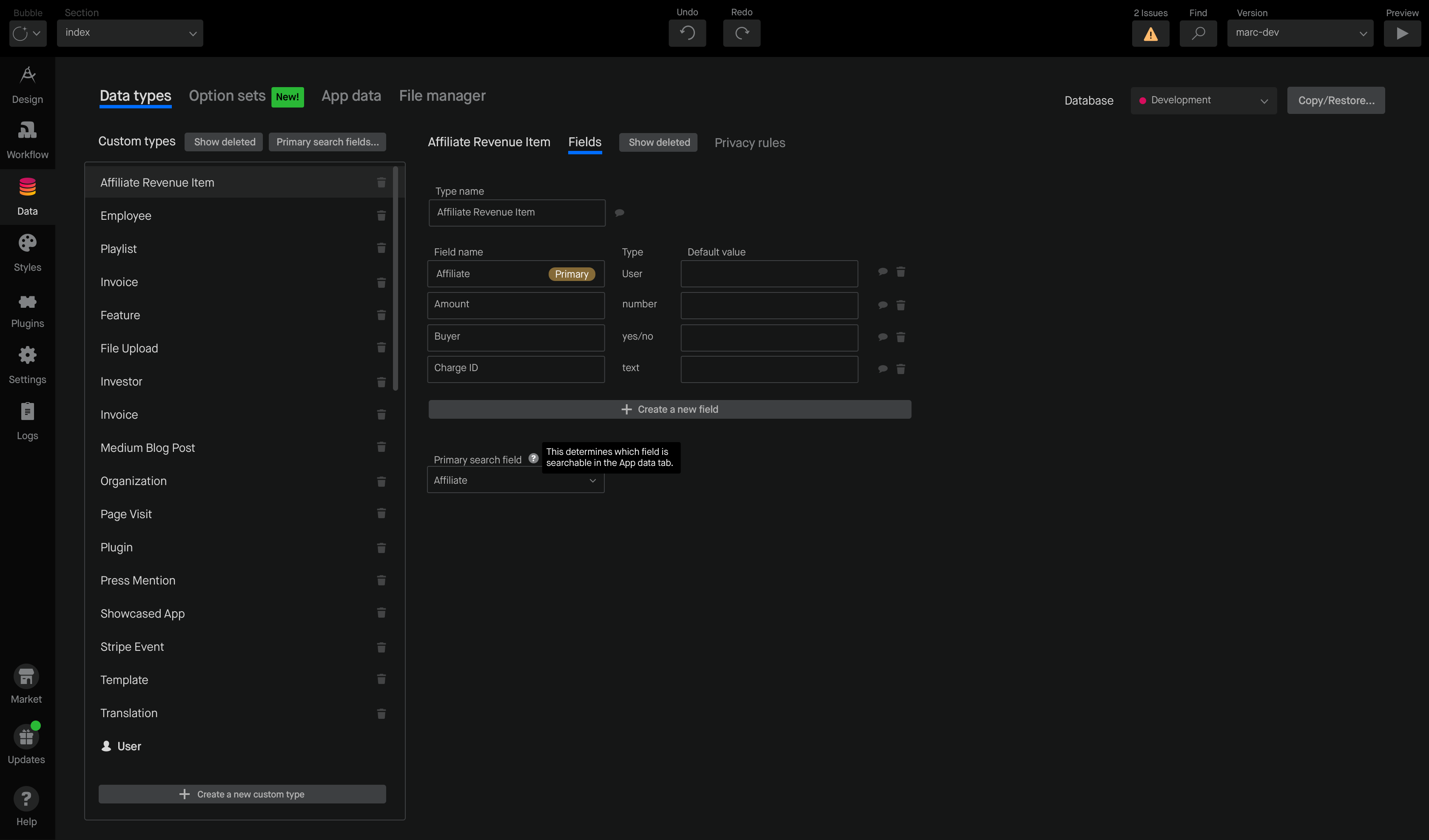
The Data tab is a visual database editor and config tool where users define, manage, and organize the data structure for their application. Users can create custom data types and specify fields for each type, such as text, number, date, or file, allowing for a structured representation of the app’s data. It also allows users to view and modify entries in the database, making it easy to add, edit, or delete data as needed.

The Styles tab enables users to create and manage reusable design styles. Users can define styles for various elements like buttons, text fields, and images, and specify attributes like font, color, size, border, and shadow. Once a style is created, it can be applied to multiple elements, so any updates to the style in this tab will automatically reflect across all elements using it.
Maison is a headless design system.
Unlike most design systems, Maison separates content from design and layout, making it both content-agnostic and highly future-friendly. This approach empowers the Bubble team to deploy updates faster, using predefined rules and classifications to dynamically display variable content. By decoupling the visual components from the content they hold, Maison provides flexibility and efficiency, enabling the team to manage and deploy designs without having to reconfigure the entire system for each change. This adaptability has been crucial for scaling, as Bubble can now handle a wide range of use cases and audiences without relying on custom-built resources for each update.
The modular nature of Maison supports Bubble’s product squads by allowing them to iterate and launch new functions without waiting on dedicated design resources. The framework’s headless structure and prebuilt UI patterns ensure that designers and developers can work independently, speeding up the production pipeline. Maison’s scalability has also enabled the team to accommodate growth with minimal disruption, fostering a more agile development environment. Product teams benefit from a streamlined, consistent design language that ensures cohesive user experiences across the platform, even as new features are introduced. With Maison, Bubble can focus on innovation and responsiveness, knowing that the design system can flex to meet future demands.
Theme switching
Maison was designed with both light and dark modes in mind from the outset, adding a new layer of versatility to the Bubble platform. Integrating these modes required a higher-order abstraction of element styles in the codebase, as styles needed to function seamlessly across both themes without duplicating assets or structures. This strategic abstraction laid the groundwork for a smooth, user-friendly theme-switching experience, where users can toggle between light and dark modes without any noticeable performance lag. Today, this is trivial thanks to the prefers-color-scheme CSS media feature, but this didn't exist yet at the time.
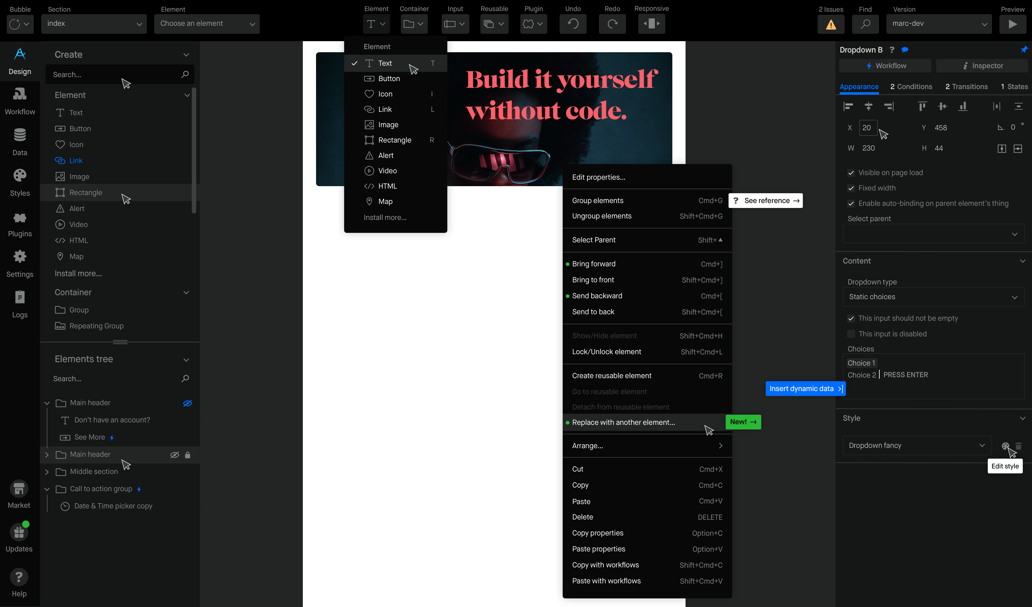
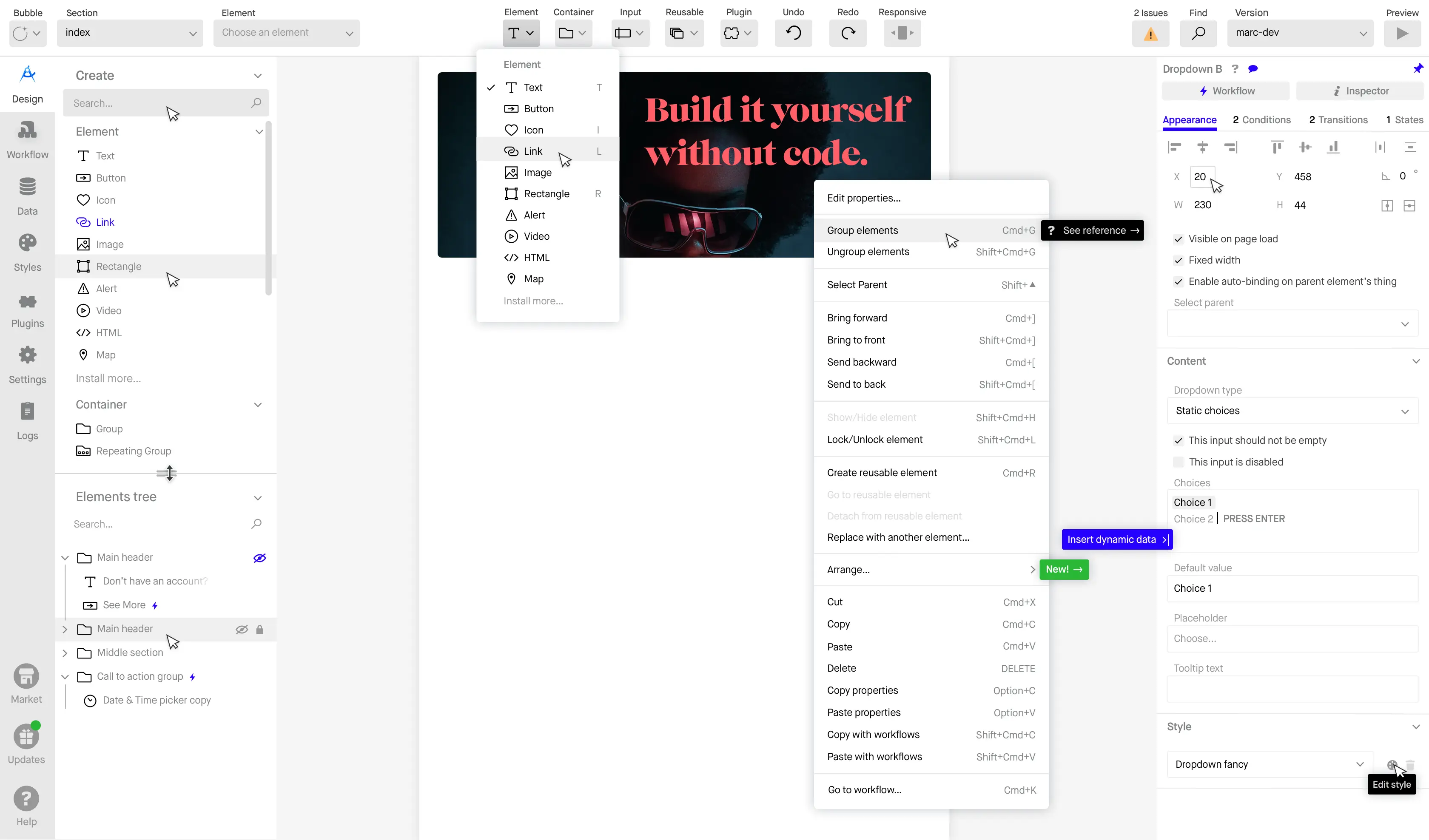

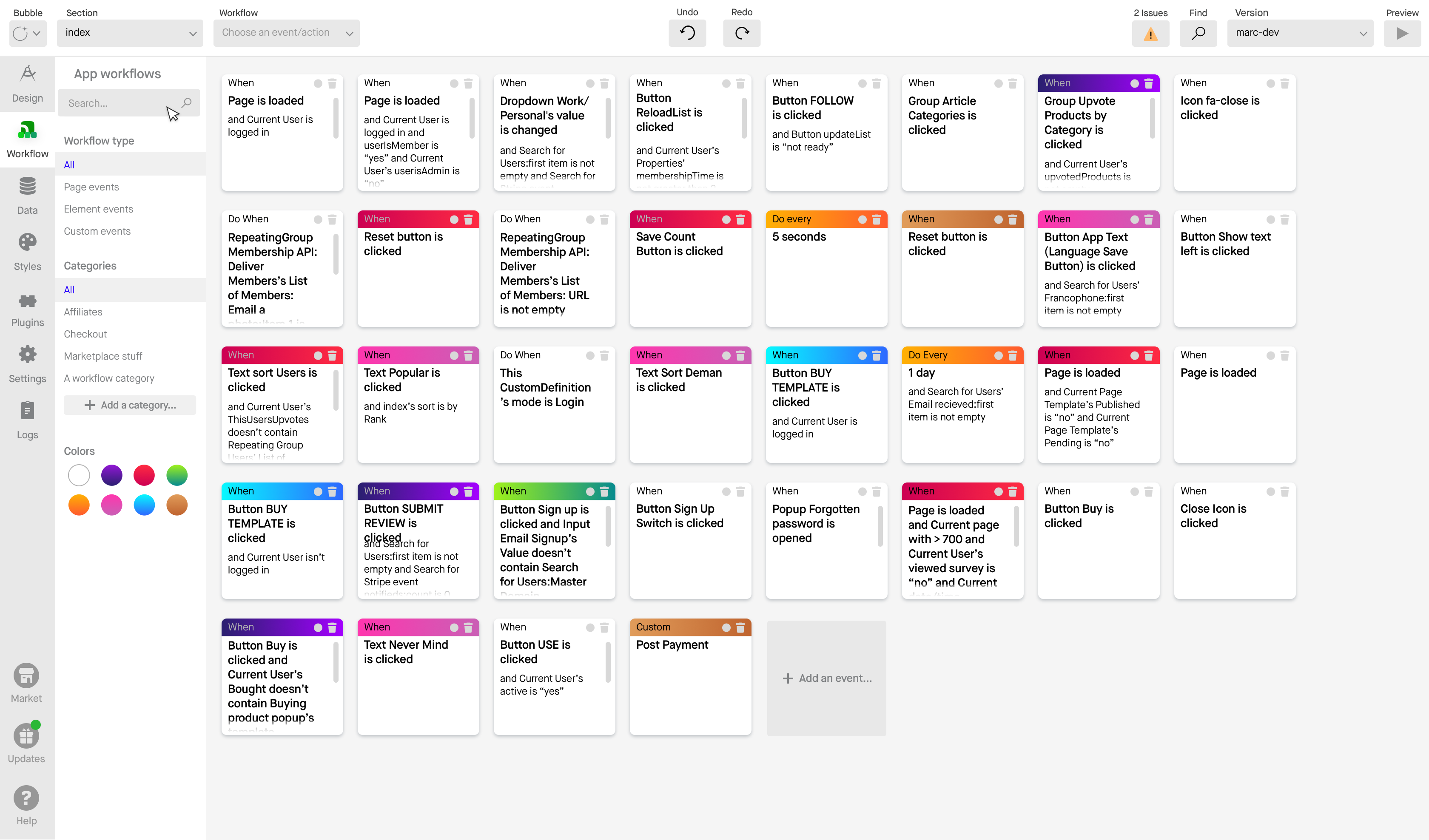
Maison’s light and dark themes bring an adaptable, visually consistent experience to the Bubble editor. We enabled seamless theme switching for users' color scheme preferences.
We built modernized and powerful responsive design tools.
A major hybrid release for Bubble was the new responsive design system. By mixing and matching three basic container types, Bubble can build modern layouts based on the flexbox CSS module. Each container layout has its own set of controls, and elements within those containers will inherit their parent container’s properties.
Responsive design on Bubble
The core idea behind these responsive tools is to centralize responsive settings within the element’s property editor, streamlining the process and making adjustments intuitive. By allowing users to set and control responsive behaviors directly within each element’s editor, designers can save time and avoid repetitive tasks, achieving flexible and adaptable layouts with minimal effort. The goal is to enable users to create any layout style needed, from single-column mobile views to multi-column desktop designs, without the complexity that responsive web design typically entails.
The responsive system within Bubble is built on three simple widgets: Resizing (Fixed Size), Pin to Edge, and Margins. These tools are similar to the layout tools used in popular design software like Sketch, making them both familiar and powerful for users. The Resizing option allows users to specify fixed dimensions for elements, while Pin to Edge lets them anchor elements to specific points on the canvas, providing consistent alignment regardless of screen size. Margins help create consistent spacing, acting as column gutters to separate content and establish uniformity. Users can see live examples of these tools in action by exploring similar features in Sketch or Studio.Design, providing a solid foundation for understanding how to implement responsive behaviors effectively.
In addition to the widgets, Bubble’s responsive toolset includes conditions that can be set for each element based on specific page widths, moving away from the idea of universal breakpoints. This flexibility means that designers can create custom conditions to govern how elements behave at different screen sizes, such as shrinking, expanding, or hiding elements at certain widths. The Responsive button in the toolbar allows users to preview how these conditions and visibility rules impact the layout. By dragging the canvas width, designers can see their responsive settings in action, making it easier to achieve a polished and adaptable user experience without needing advanced coding or CSS adjustments.
Resizing & Pin to edge are similar to the layout tools used in Sketch. Column gutters can be created using Margins. Instead of universal breakpoints, each element can recieve conditions that govern changes to these properties at specific page widths.
Maison shines in the Property Editor, the panel that contains the majority of Bubble UI.
The property editor is Bubble's surface for configuring each element’s appearance, behavior, and data connections. The property editor also allows you to set up conditional logic to modify the element's appearance or visibility based on certain criteria and connect it to workflows to trigger specific actions.
I established a user research practice within our customer expert team.
As a lean team of 30, Bubble lacked the resources for a dedicated user research function, which made gathering rapid, actionable feedback a challenge. To address this, I implemented a user research practice within our Customer Success team. By training and guiding Success team members to take on UX research responsibilities, we created an efficient feedback loop that connected product design with real user insights. This approach enabled us to tap into the Customer Success team’s direct interactions with users, allowing us to capture detailed feedback on pain points, needs, and reactions to new features without needing a separate research department.
Empowering our Customer Success team as UX researchers brought the voice of the customer directly into our development process. This practice allowed us to identify issues early, adapt designs in real-time, and maintain a user-centered approach even with limited resources. By incorporating user feedback in a structured, ongoing way, we ensured that our product decisions were informed by genuine user experiences, helping Bubble evolve in ways that resonated with our community and addressed their most pressing needs.

The Bubble team in 2019. Our redesign team was a dedicated group composed of designers, engineers, and members of our Customer Success team who had taken on new roles in user research. This cross-functional team worked closely together to bring the vision of an updated Bubble editor to life.
Delivering a successful rollout
To manage the complexity of our redesign, we broke down feature development and improvements into frequent, manageable releases. This approach enabled us to deliver new components and adjustments gradually, allowing users to experience the editor updates in digestible increments. I kept users involved in the process from the beginning, soliciting their feedback on early concepts for the new editor to ensure our design direction aligned with their needs. At the same time, we couldn’t put other responsibilities like bug fixes and customer support on hold, so maintaining balance was essential.
Our commitment to iterative, user-informed development gave us confidence in our approach while maintaining agility in responding to immediate issues. By releasing updates regularly, we minimized the risk of overwhelming users with large-scale changes, and instead created a smoother, more continuous improvement process. This also allowed us to make real-time adjustments based on user feedback, ensuring each rollout met user expectations and improved the overall experience.
Project management
To manage this complex redesign, I used a project management approach called Shaping to clearly define and structure project work, reducing timeline risks and maintaining momentum. Shaping allowed us to characterize each part of the project, prioritize components, and divide work effectively across the team. With this structured approach, we could tackle the new components methodically, rolling out new sections incrementally and refining them with input from key users we’d partnered with during development.
This approach to project management empowered our team to stay on track, shipping updates consistently while keeping users engaged in the process. By breaking down the redesign into manageable pieces, we minimized potential delays and ensured that each part of the editor overhaul was given careful attention. Shaping provided clarity and direction, allowing us to continuously move forward with confidence and avoid the risks associated with large, monolithic releases.
Bifurcating visual & workflow improvements
Given the ongoing need to release important features, we implemented a parallel strategy to manage the integration of new UX patterns into the existing UI. This hybrid approach allowed us to roll out visual and workflow improvements gradually, even as feature development continued. For many features already in progress, we adapted elements of the new design system into the existing UI, ensuring that enhancements could be launched without being delayed by the larger overhaul.
This approach not only minimized disruption but also provided valuable insights into how these improvements impacted key performance indicators. By releasing changes incrementally, we could monitor user reactions closely and adjust accordingly, avoiding the potential pitfalls of a massive update. This incremental rollout strategy reduced the risk of disorienting users and ensured a smooth transition to the new interface, with each small release contributing to a cohesive, user-friendly final product. It allowed us to move forward with a steady flow of improvements, optimizing the user experience without risking the stability of the platform.
Outcomes
The Maison design system has had a transformative impact on Bubble’s development and user experience, empowering developers to roll out features with a consistent UI without needing direct design intervention. By establishing a unified set of rules and components, Maison streamlined the entire product development process, ensuring that new features adhered to Bubble’s visual standards automatically. This consistency has not only improved the overall quality of Bubble’s interface but also enabled faster development cycles, as teams can implement updates without the bottleneck of bespoke design work. Maison has thus broadened access to powerful tools for building web applications, bringing Bubble in line with the best-in-class design tools in the industry, such as Figma and Webflow.
Maison’s contribution to Bubble’s evolution is clear and measurable, with substantial gains in usability and efficiency since its deployment. The new design system has elevated the user experience by introducing cohesive, predictable interactions, which make the platform more approachable and intuitive for a wider audience. For Bubble users, Maison represents a significant improvement in the way they interact with the platform, providing a more refined and user-friendly environment. This leap forward has helped solidify Bubble’s position in the no-code market, as the streamlined experience now rivals that of leading design platforms known for their polished interfaces and ease of use.
The impact of Maison on Bubble’s performance is quantifiable. Data collected over the 30 days following the final beta release of the Maison components reveal significant improvements across various metrics. These numbers underscore the positive changes brought by the redesign, highlighting the value of a consistent, adaptive design system.
By standardizing the UI and enhancing the overall visual experience, Maison has resulted in tangible benefits that are visible not only in qualitative feedback from users but also in measurable growth metrics.

